Leveraging Opinionated Defaults to Power Growth
What it means to use “opinionated defaults,” successful examples from Patreon, AirBnB, Box, Canva, GoFundMe, Perplexity, Lyft, and Yelp, and a framework for deciding on your own defaults
Hi there, it’s Adam. I started this newsletter to provide a no-bullshit, guided approach to solving some of the hardest problems for people and companies. That includes Growth, Product, company building and parenting while working. Subscribe and never miss an issue. If you’re a parent or parenting-curious I’ve got a podcast on fatherhood and startups - check out Startup Dad. Questions you’d like to see me answer? Ask them here.
It’s been a minute since my last newsletter! Primarily because I’m heads down working with the team at Mozilla which doesn’t leave as much time for writing. Fear not, I have a queue of mostly-finished drafts that are close to release. As always, if you have a topic you’d like to see me cover you can submit it here.
The Eastern part of the U.S. has been hit really hard by Hurricane Helene and people are struggling. If you’d like to donate to recovery and support efforts you can visit this link for some recommendations. My family chose the United Way of North Carolina. (side note: this is also an incredible UGC growth loop).
I’ve worked at or with a lot of B2B2C and marketplace companies and one topic that always comes up is how to teach your “B’s” to better engage with their “C’s.” In other words, if data suggests that doing X, Y, or Z behavior will lead to the businesses you support doing a better job serving (and acquiring, retaining or monetizing) their customers, how do you make that happen?
And when should you intervene versus allowing maximum flexibility and choice on your platform?
Examples of this are everywhere:
How do you encourage Lyft drivers to be at the right places to capture demand?
What’s the optimal number of membership tiers on Patreon and how do you make sure creators choose that and price appropriately?
How much should tutors price their services on WyzAnt?
What’s the ideal cadence for a membership offering at Table22?
How do I get started with using a product like Notion?
…the list is almost infinite!
One answer comes from a product principle we established when I was at Patreon – leading with opinionated defaults. Hat tip to Camille Hearst, an incredible friend and product leader, for teaching me that term.
I’ve seen opinionated defaults transform site experiences, shape behavior, and drastically improve metrics. In this newsletter I’ll unpack the concept and share some successful examples of leveraging opinionated defaults throughout my career.
What are Opinionated Defaults?
To understand opinionated defaults we should first understand “defaults” in general. Defaults have existed for decades, if not centuries. If you walk through a grocery store you will observe the role of merchandising in establishing default choices. Why is that cereal at a certain level? How do you choose the right toothpaste amongst a sea of brand extensions? Partially it’s because CPG companies pay for shelf placement to get certain products at eye level. This is the power of defaults in action.
Nowhere is this better articulated than the book “Nudge” by Nobel and Holberg Prize winners Richard Thaler and Cass Sunstein. An excerpt from the introduction, focused on a fictitious example of a food services director at a school district:
“Simply by rearranging the cafeteria, Carolyn was able to noticeably increase or decrease the consumption of many food items. From this experience she learned a big lesson: small changes in context can greatly influence schoolchildren, just as they can greatly influence adults. The influence can be exercised for better or for worse. For example, Carolyn knows that she can increase consumption of healthy foods and decrease consumption of unhealthy ones.”
The authors go on to describe “Carolyn” as a choice architect or someone who has “the responsibility for organizing the context in which people make decisions.”
As product builders we are all choice architects who establish defaults. Those defaults are predefined choices made for the user.
A product principle focused on leveraging opinionated defaults is one where in as many places as you can you’re putting your thumb on the scale and strongly suggesting a course of action.
Intercom talks about this in their product principles: “Opinionated by default; flexible under the hood.” This has led their product in a direction of being easy to use “right out of the box” but almost infinitely customizable if needed.
Another way to think about opinionated defaults is like the executive summary of a document. The author is telling you what the most important information is based on their knowledge of the document. You can get most of the benefit by reading the summary (or following the default suggestions) but a power user may want to dig into the details (customize beyond the defaults).
Now that we’ve established what it means to leverage opinionated defaults let’s look at some examples across location, pricing, payment methods, templates and login.
Opinionated Default Examples
Location
One subtle-but-straightforward opinionated default is the use of location detection to prefill choices. This became possible during the rise of mobile and Google’s emphasis on location-based search.
This morning, for example, I’m at my daughter’s lacrosse practice in Los Altos, CA. Opening up Yelp you can see that they’re defaulting to my local surroundings – makes sense: even though I might not want a burger or a haircut at 8am on a Sunday I certainly do want to find things around me (like coffee). By assuming that (having an opinion) they’re removing one step from my process and making it easier to search nearby.
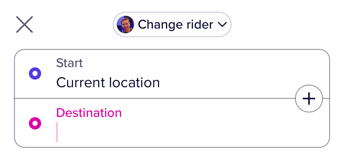
Lyft, and just about every other location-based service, does the same thing:
Lyft will take it a step further though and if you request a ride that’s not originating from nearby they’ll make sure you aren’t crazy and ask you to confirm. They’re putting their thumb on the scale to make sure you didn’t make a mistake.
Pricing
There are a few different flavors of opinionated defaults in pricing. Let’s start with the B2B2C or Marketplace use case - when the user can set their own price to offer customers (think Patreon, Shopify, AirBnB, Eventbrite, etc.). This is different from a Lyft or Uber that has a predefined price based on distance and time; in these examples the supplier has flexibility to price their product however they want.
One example of this is membership tiers at Patreon. When I worked there we were able to determine that the optimal starting tier price for a creator was $3 or more. The challenge was that creators had been setting $1 as their starting tier price for years and most creators copied what other, influential creators were doing. The other challenge was that when you created a new tier we showed a grayed out starting price of $1 (in the screenshot below they now show $0 but have a tooltip recommendation).
Here is where the power of opinionated defaults comes into play. We wanted to find ways to shift the lowest tier price that a creator was offering from $1 to at least $3 because this would help them maximize their conversion, earnings and profit on the lowest tier. But we also knew that creators needed the flexibility to choose whatever pricing they wanted; removing that flexibility wouldn’t be putting creators first (which was our #1 core behavior at the company).
So rather than mandate $3 we simply changed the grayed out text from $1 to $5. That was it; we shared our opinion of the default price. And immediately the selection of the $1 tier dropped precipitously - by close to 50-60%. From a single, grayed-out-default change.
Now Patreon has changed the default back to $0 but with a recommended tier price in a tooltip with a link to learn more. This may work just as well as the previous change (I’m skeptical, but assume they experimented with it) but regardless the tactic is the same.
Another example of supply-side opinionated defaults for pricing is marketplaces like AirBnB. This example includes a consolidation of both location-based defaults as well as pricing. AirBnB is pre-selecting multiple choices for the host, such as: where I’m located, how many days I’m renting my house out, the nightly price and details about my house, etc. In doing so they’re able to show the prospective host an initial earnings amount with zero work on the host’s part. They then make it incredibly easy to modify and adjust their default selections which as a user you're more likely to do after seeing you could make $1309/week.
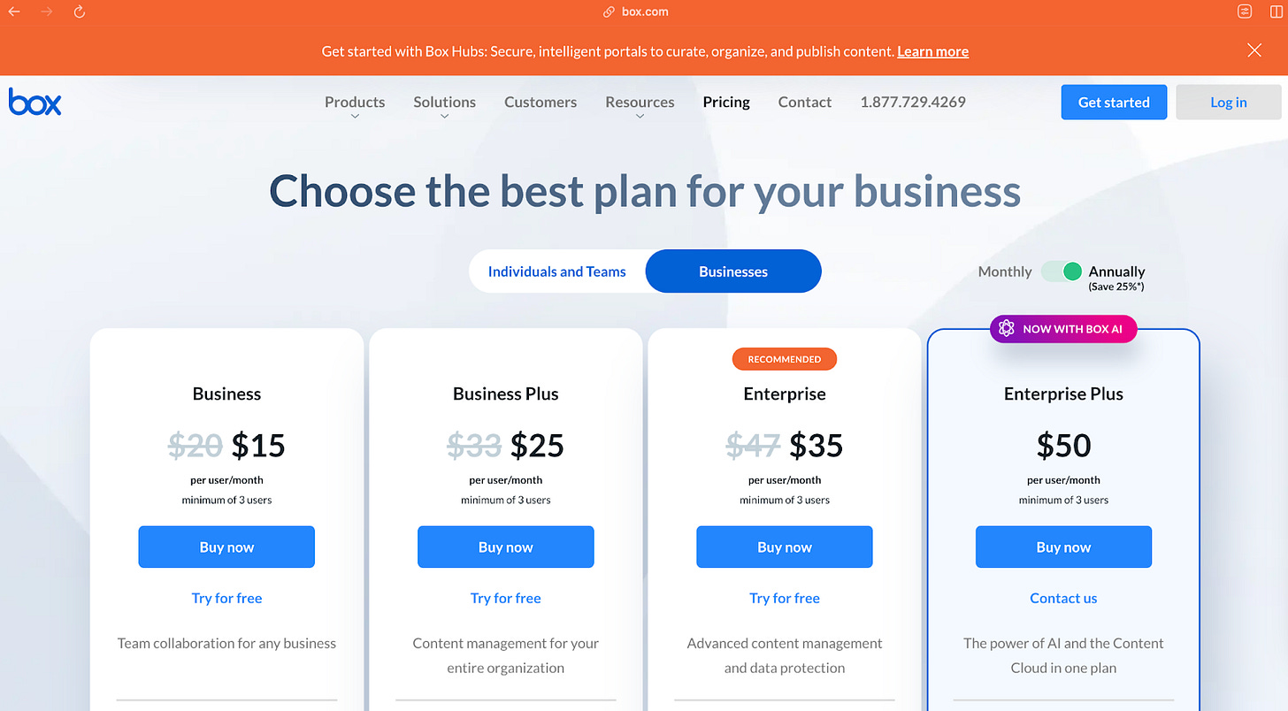
Furthering this tactic on the purchasing (demand) side is the “suggested tier.” You’ll find this on the majority of SaaS products such as the Patreon and Box examples below. Here we see both companies recommending a subscription tier - $7 in the case of the True Crime Obsessed podcast and the $35/mo Enterprise tier in the case of Box. Both companies are exerting their influence (opinion) on the tier selection.
Another common opinionated default in pricing is in donation checkout flows. Here is a simple example from a fundraiser for my kids’ local school - they’ve included default amounts for 1 kid, 2 kids, 3 kids, etc.
Payment Methods
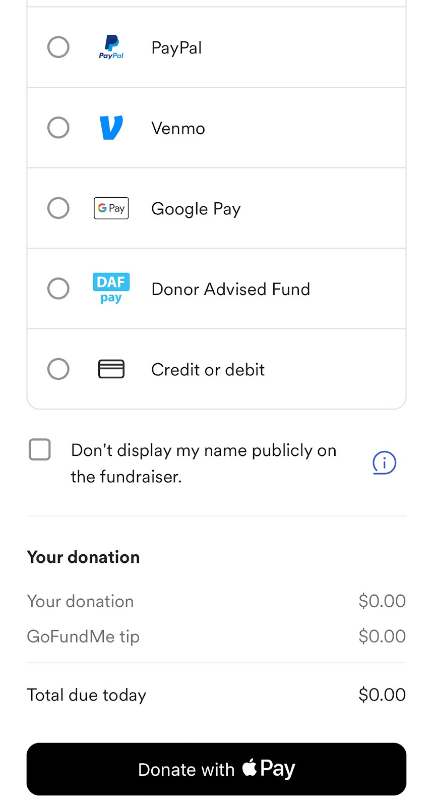
Speaking of checkout flows; payment method selection has become an opinionated default in most of them. Take this example from GoFundMe – here they’ve detected that I’m on an iOS device (because I was browsing via Safari on iPhone) and recommended Apple Pay as my default payment method. I can say that without fail whenever I see this suggestion I use it; it has made payment selection so much easier.
Templates
I’ve written about templates as an effective acquisition loop strategy but they’re also a way of providing opinionated, default choices on how you can use the product. Imagine that you’re an educator looking for ways to leverage Canva to make lesson plans or posters for your classroom. A quick view of Canva for Educators gives you 20,000 options that you can choose from, narrow in on and start creating with. No template edits required!
Login
One final example of opinionated defaults is around login – first with Facebook login many years ago and now, primarily with Google and (to a lesser extent) Apple. In many cases products will recommend and default to a Google login as a means of reducing friction. The opinion is that almost everyone has a gmail account and doesn’t want to remember passwords. Of course, there are examples where maybe we’ve gone too far (see AirBnB) on recommending login options.
Now that we’ve seen some examples of opinionated defaults it’s important to know how and when to apply them.
Framework for Opinionated Defaults
Here is a general framework that you can use in your own company for deciding when and where to put your thumb on the scale with an opinionated default.
Identify Key Decisions
Always start with your users (duh) and identify the critical decisions that they have to make in your product. These will be the areas where they can become overwhelmed with too many choices or need to take a few too many steps. In observing user behavior if you see them getting to that state of overwhelm, hesitating or making suboptimal decisions then you have a prospective area for making a default decision.
Leverage Data to Define Defaults
When leveraging data I like to start with a successful outcome (an engaged, retained user) and back up into the choices they made while setting up the product. Look at their behavioral data and see if you can identify clusters of common choices. If you can, those are great candidates for an opinionated default. Our Patreon example that showed a tier of $3-5 maximized earnings and patron retention while not hampering conversion is a great example of this.
Balance Flexibility with Control
Your goal should be to design defaults to “nudge” users toward the best decision that maximizes their outcomes and yours. You want to simplify the decision-making process as much as possible but not eliminate their ability to personalize and extend. There is a limit though and unless you’re LinkedIn or Zoom you don’t want to build a toggle for everything (I would argue even they shouldn’t). You’ll have to eliminate some optionality and choice when it’s catering towards a very few power users. You can leverage data (point #2 above) to size the audience within the different choice clusters.
Iterate and Optimize Based on Feedback
One person’s default today may not be their default tomorrow. As user preferences and behaviors change you’ll have to revisit some of your defaults. A process of gathering that feedback, leveraging data, and experimenting with default choices will help you get to new defaults over time. Patreon changed the grayed out text of a tier to $0 but then added recommendations via tooltips. This may be an optimization based on a new default.
Remove Friction (for New Users especially)
You have a very, very limited window of time for a new user to get value from your product. The more opinions you can have for default choices the better off you’ll be and the more likely your product is to be intuitive to a first-time user. It’s like that executive summary I mentioned above. It provides a way for someone to get the most streamlined experience while also later having the option to lean in and explore more nuanced settings. For example, if Zoom didn’t make a bunch of default choices for their users you’d never get to experience the magic of a smooth and crisp video call. You’d still be customizing your options instead of reading this newsletter.
Wrapping it Up
Hopefully you’ve now come to appreciate the power of an opinionated default – what it is, who uses them, and how you can choose when you should. The default choices you present (or don’t) to users can transform site experiences, shape behavior, and drastically improve metrics. I’ve seen this work at every single company I’ve worked for – from recommending delivery sizes at Imperfect Foods to default search radius for rental cars at Hotwire; from auto-accept next ride at Lyft to tip recommendations on the payment screen.
The key to doing this right lies in the framework I shared above:
Identify those key decisions
Leverage data to define your defaults
Balance flexibility with control
Iterate based on feedback and evolving preferences
Remove friction (for your new users especially)
Thanks for reading this week! And reminder that if you have a topic you’d like to see me cover you can submit it here.


